Arrowleaf Real Estate
Arrowleaf Real Estate came to us looking for a polished logo that exuded professionalism without feeling overly formal or complicated.


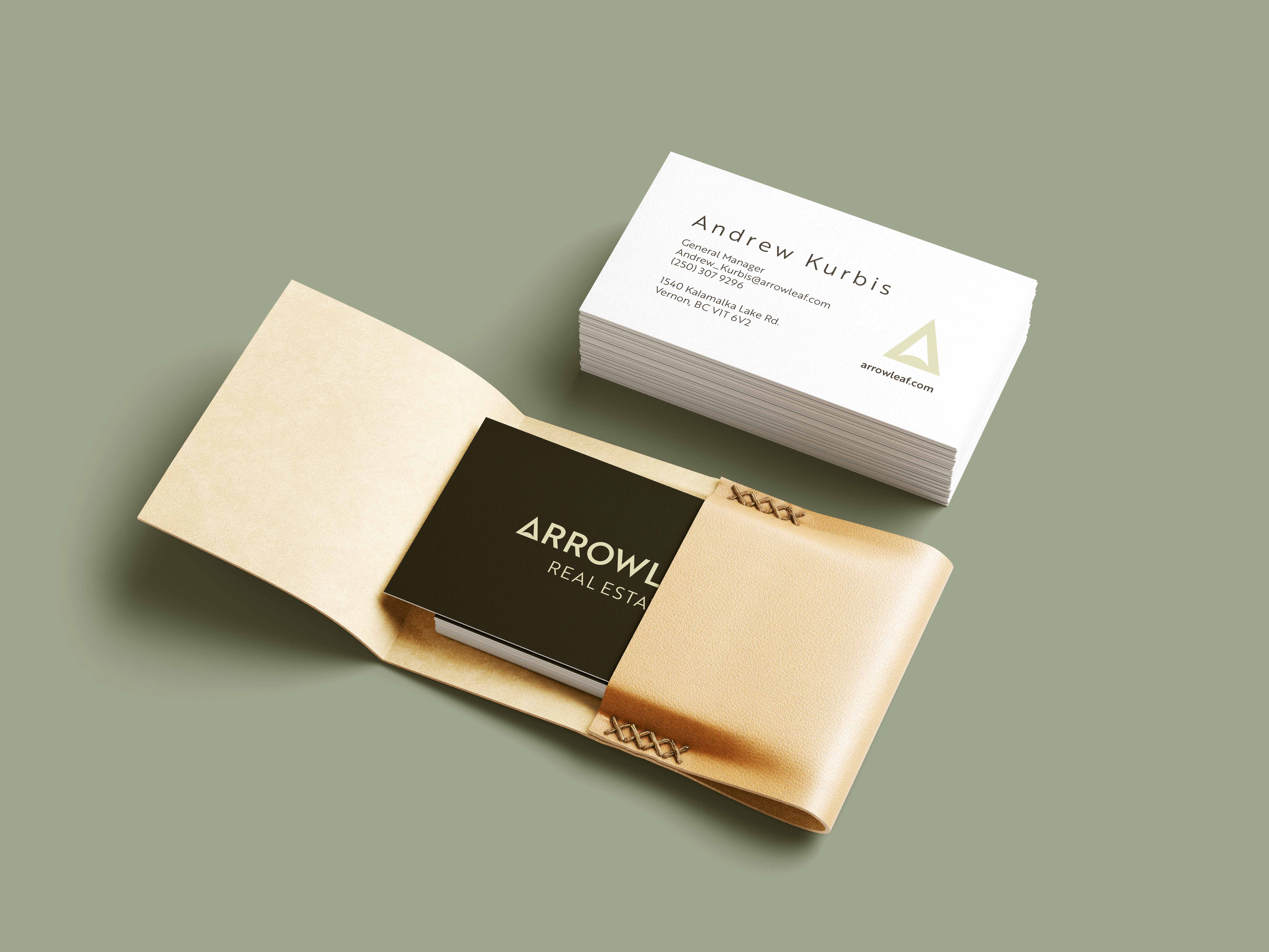
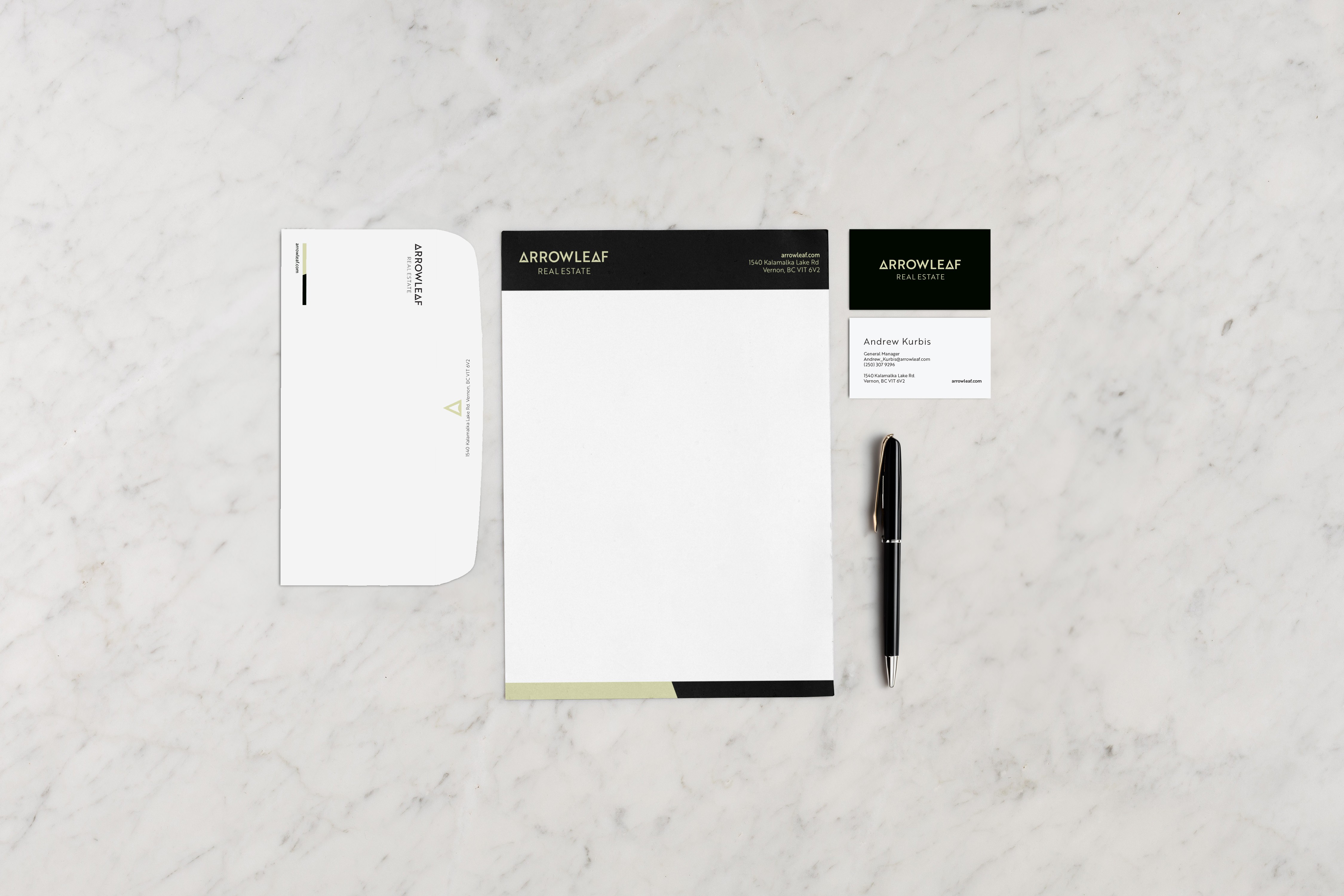
Our solution centered around the concept of growth and direction, subtly incorporating an arrowleaf motif into the design. The colour palette, inspired by nature, combined shades of green for growth and harmony with a charcoal grey to add a balance and professionalism.

A bold and versatile font was chosen to create touch of approachability while ensuring readability across various applications. The final logo seamlessly integrates these elements, creating a unique and memorable visual identity for Arrowleaf Real Estate.
The comprehensive deliverables include a style guide for consistent branding, a stationery package reflecting sophistication, and a simple landing page for a cohesive online presence. This design approach positions Arrowleaf Real Estate as a trustworthy and distinguished player in the real estate market, marrying professionalism with a welcoming touch.