North Okanagan Hospice Society
Having collaborated with North Okanagan Hospice Society (NOHS) since 2006, we eagerly embraced the opportunity to work with them to rejuvenate their logo and branding.

The objective of the redesign was to cultivate an image that exudes warmth and positivity. The goal was to steer away from overly solemn associations often linked with hospice services, while maintaining a respectful and appropriate tone.

Our primary focus in North Okanagan Hospice Society’s rebranding initiative was to:
- Increase visibility and encourage conversations about end-of-life experiences, emphasizing the potential for joy in the process.
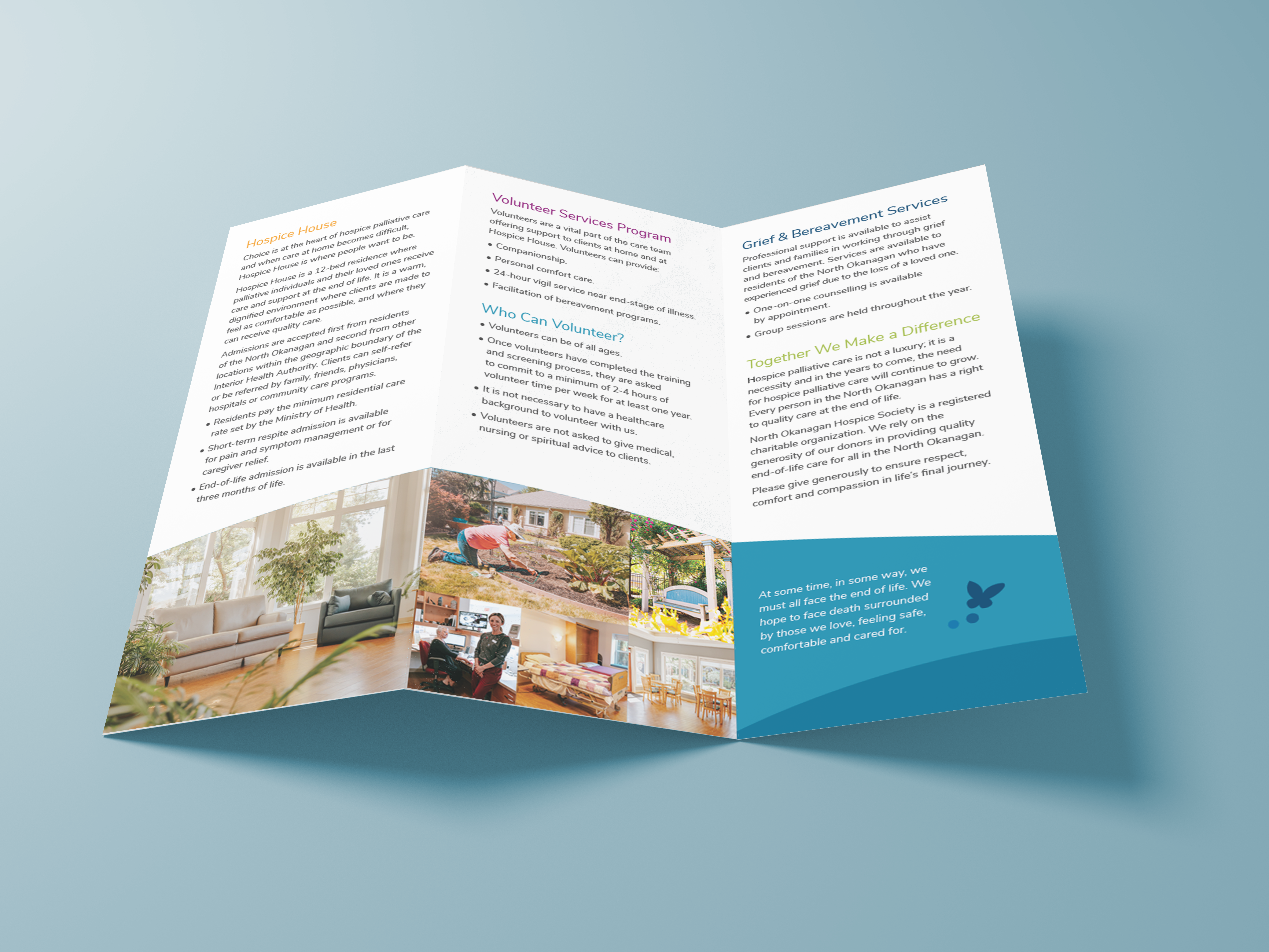
- Convey the idea that NOHS transcends its physical space (Hospice House). Communicate a comprehensive range of services to residents, their families and community.
- Raise awareness of the crucial need for charitable support and highlight the generosity that sustains these services.
- Showcase the expanded community outreach of Hospice services through a strategic rebranding effort.
- Convey the diverse paths individuals take to access services. Foster connections with families and residents before the need for palliative care arises.

